

I decided to take design a different direction and show you here where I have failed as a designer.
Some of it is happening real-time. Others have been past projects that maybe still leave me scarred. But all of these failures have a story.
So to the one at hand.
I was doing a project for my friends at V3 Movement. They wanted a new logo to use with their church planting organization. So as usual, I drew a lot of logos. I sketched. I drew on the iPad. I played around in illustrator…all with the hopes of finding that fit.
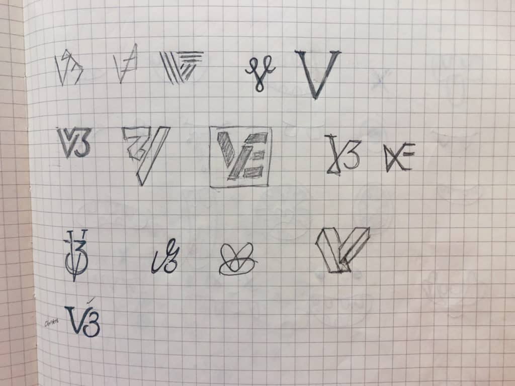
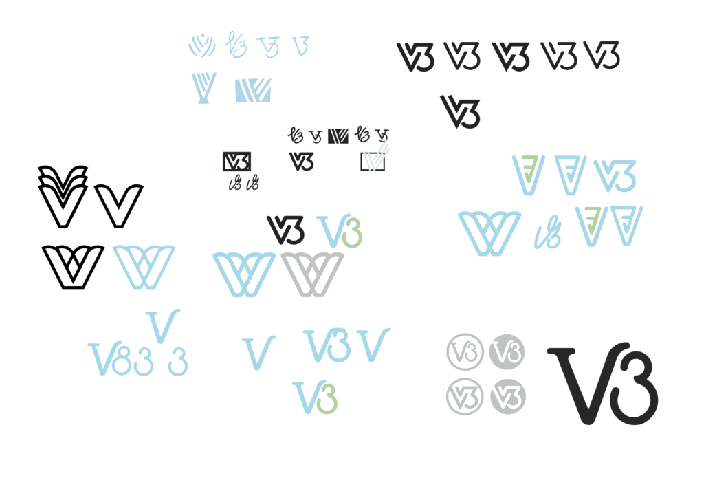
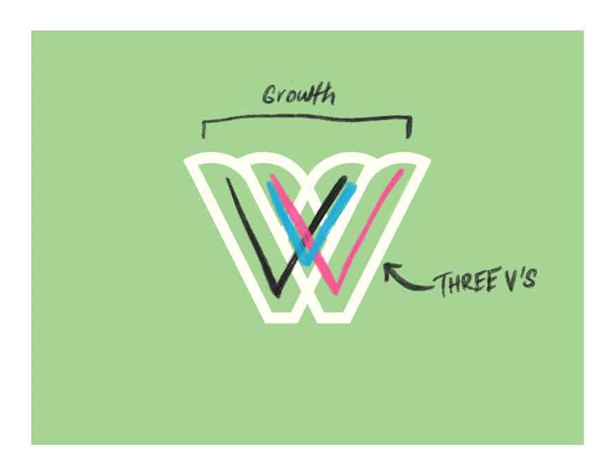
And at one point, I thought I had it. I had found a way to combine 3 V’s into what looked like a growing plant. That was it. This was the logo. It was everything they were looking for. They would love this one.

Until they didn’t.
They didn’t see the 3 V’s like I did, which was understandable. But I still loved it and gave it a legit push.
In the end, they decided to go with a more clean and styled V3 logo for their organization moving forward.

If you liked the above unapproved logo and would like something similar, drop me a line and let’s chat.