
John and Lillian Miles Lewis
Foundation Branding
The start of 2021 brought Haymaker a project that was not only exciting, but had deep meaning.
We were tasked to create the brand look, voice, and external feel for the John and Lillian Miles Lewis Foundation. Throughout the process, speaking to board members, former chiefs-of-staff, reading as much as we could, and diving into documentaries on who really John Lewis was, we kept coming back to his words.
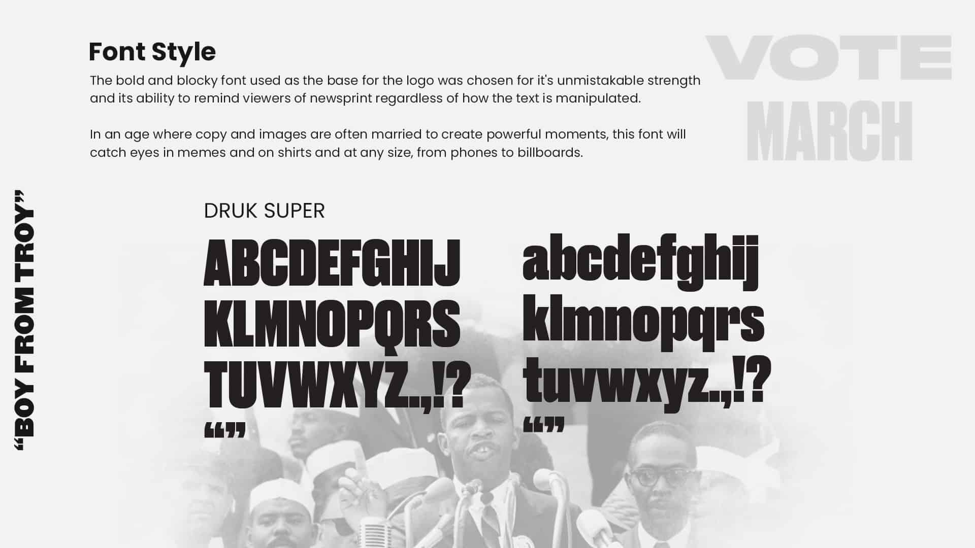
Everything John Lewis said had weight. People hung on his every (carefully chosen) word and his ability to speak volumes while "keeping it plain." Often, his words were emboldened by repetition and emphasis, creating impactful quotes and "sound bites" that helped to quickly define and deliver a message that would cut through all the noise that could distract from his mission.
Powerful. Meaningful. Impactful.
Scope:
Branding
Brand Voice
Imagery and Video Voice
Website Copy
Concepting
Throughout our conversations with the board and our own diligent research, we kept coming back to themes that represented John Lewis and his wife Lillian Miles.
Faith. Family. Justice. Art.
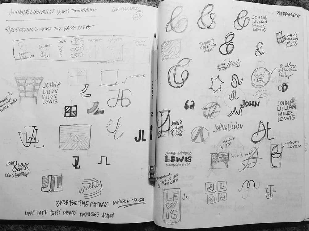
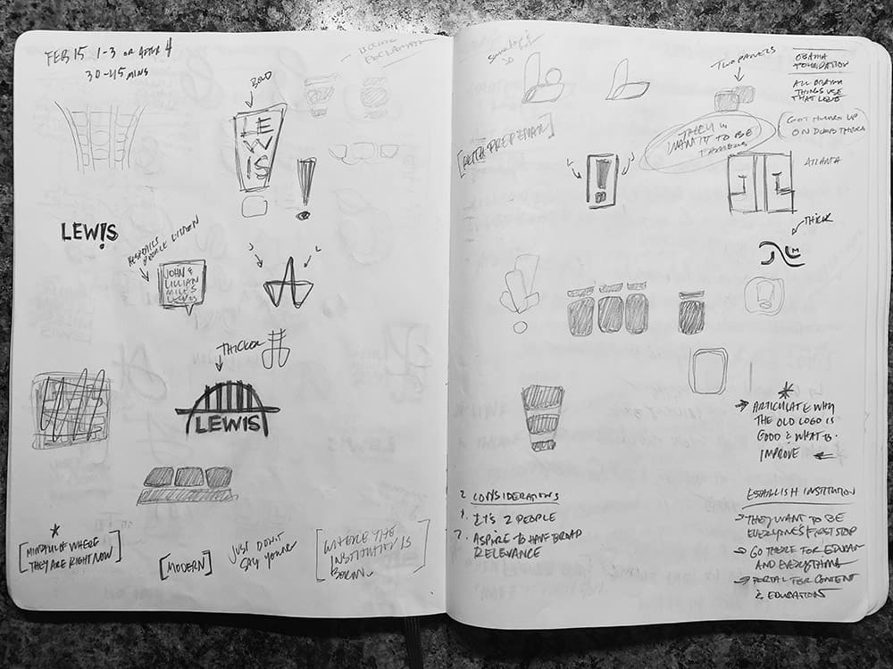
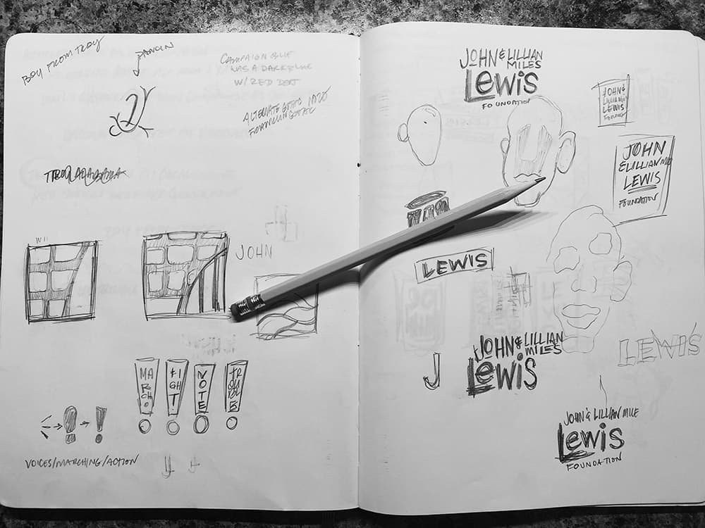
We spent hours diving into those themes, looking into his convictions and the African-American artists he loved. We found hitching posts of sorts that were important in his life and examined those deeply. We played with monograms for John and Lillian's names, but ultimately finding we didn't like that direction. We researched the Edmund Pettus Bridge and it's interesting design and worked through adding that into the mark. We looked at a lot of different areas to get to our ultimate finalists, as you can see from the sketch images above. We didn't care so much about what was coming out, but that we were throwing out everything that we could think in order to get to a point we were proud of.
From there, we narrowed it down to three concepts we thought represented his life and the future of the organization that we presented. But even in that, we found the two that we thought were the strongest and concentrated our efforts on building a story and concept around them.
The Finalists
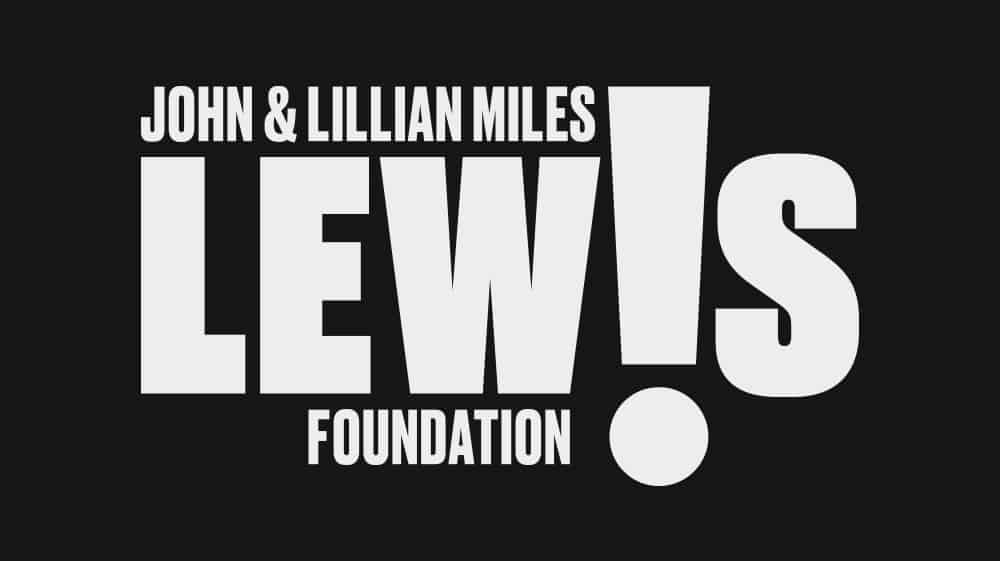
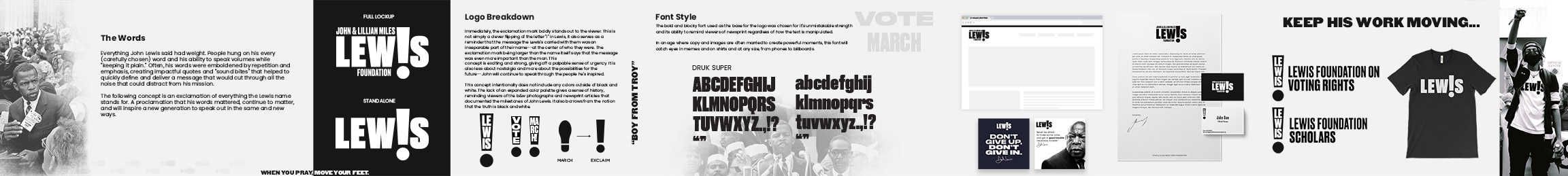
The Words
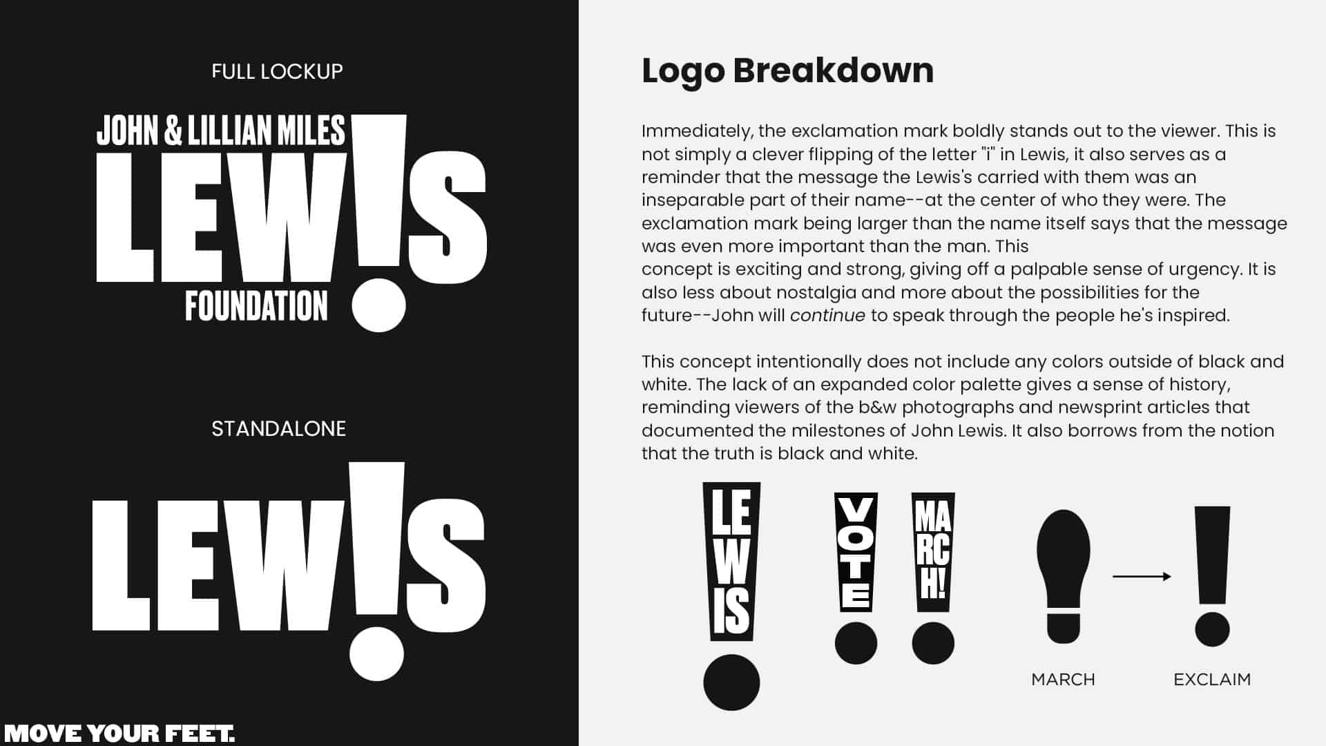
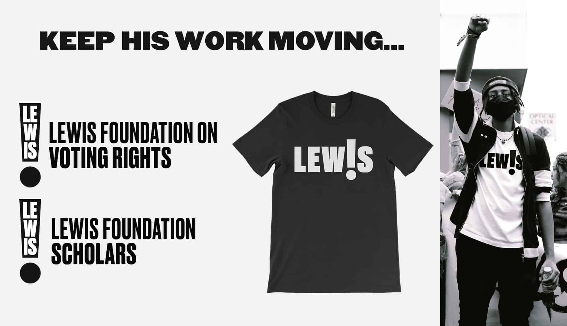
Immediately, the exclamation mark boldly stands out to the viewer. This is not simply a clever flipping of the letter "i" in Lewis, it also serves as a reminder that the message the Lewis's carried with them was an inseparable part of their name--at the center of who they were. The exclamation mark being larger than the name itself says that the message was even more important than the man. This concept is exciting and strong, giving off a palpable sense of urgency. It is also less about nostalgia and more about the possibilities for the future--John will continue to speak through the people he's inspired.
This concept intentionally does not include any colors outside of black and white. The lack of an expanded color palette gives a sense of history, reminding viewers of the b&w photographs and newsprint articles that documented the milestones of John Lewis. It also borrows from the notion that the truth is black and white.
Words Stylescape
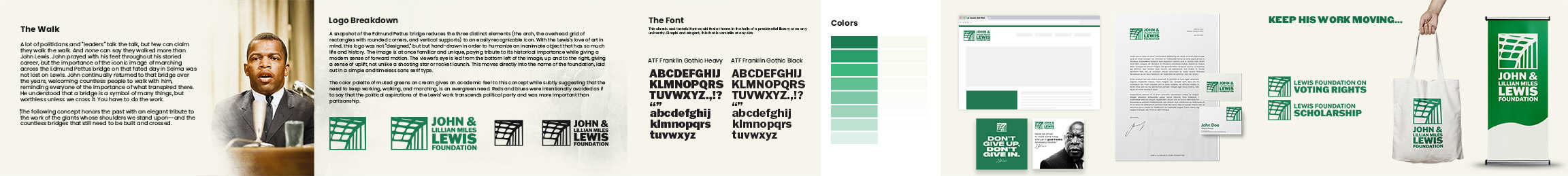
The Bridge
A lot of politicians and "leaders" talk the talk, but few can claim they walk the walk. And none can say they walked more than John Lewis. John prayed with his feet throughout his storied career, but the importance of the iconic image of marching across the Edmund Pettus bridge on that fated day in Selma was not lost on Lewis. John continually returned to that bridge over the years, welcoming countless people to walk with him, reminding everyone of the importance of what transpired there. He understood that a bridge is a symbol of many things, but worthless unless we cross it. You have to do the work.
The following concept honors the past with an elegant tribute to the work of the giants whose shoulders we stand upon--and the countless bridges that still need to be built and crossed.
Bridge Stylescape
Chosen Look
We were thrilled when the board chose the Words package as their brand. We felt like it spoke to who John and Lillian really were; people who made it plain, spoke plain, and made things happen. Tie in the exclamation point, its root meaning and the fact that it really does represent action, we thought it was a homerun identity.
Thank you to the John and Lillian Miles Lewis Foundation Board and consultants that helped and trusted us throughout the project.
Video animation from Alex Welgraven
